
By Scott Shephard
Beginning this week, I plan to post at least two photos each month that include a little bit about the thought (art) and process (craft) that go into making a photo. For those not interested so much in how photographs are made, I respect that. For you, here’s all you need to know: this is a shot of the rotunda area of the Utah state capitol building. I took this photo back in 2013 and I’m proud to say that prints of this photo, along with two others of the capitol , were purchased by the state of Utah to hang in the state finance office. That’s it. Thanks for your time.
For those wanting a bit more, here goes. First, below is the original photo (Photo #1). What the camera saw, isn’t really very close to what I saw. The biggest issue, as I suspect you will see, has to do with the strange yellow color in the photo and the relatively poor exposure of the central part of the photo. The lights probably use sodium vapor bulbs, which put out a very yellow/orange hue, which a camera sees but our eyes don’t

Photo #1
Photo #2 shows the fix, which involved something called dodging and burning (carry-over techniques from the age of darkrooms) and brushing in color correction to help the yellow areas more closely match the cool look of the lighted area directly in from of me. I also adjusted the exposure of the central part of the photo.Here’s the result:
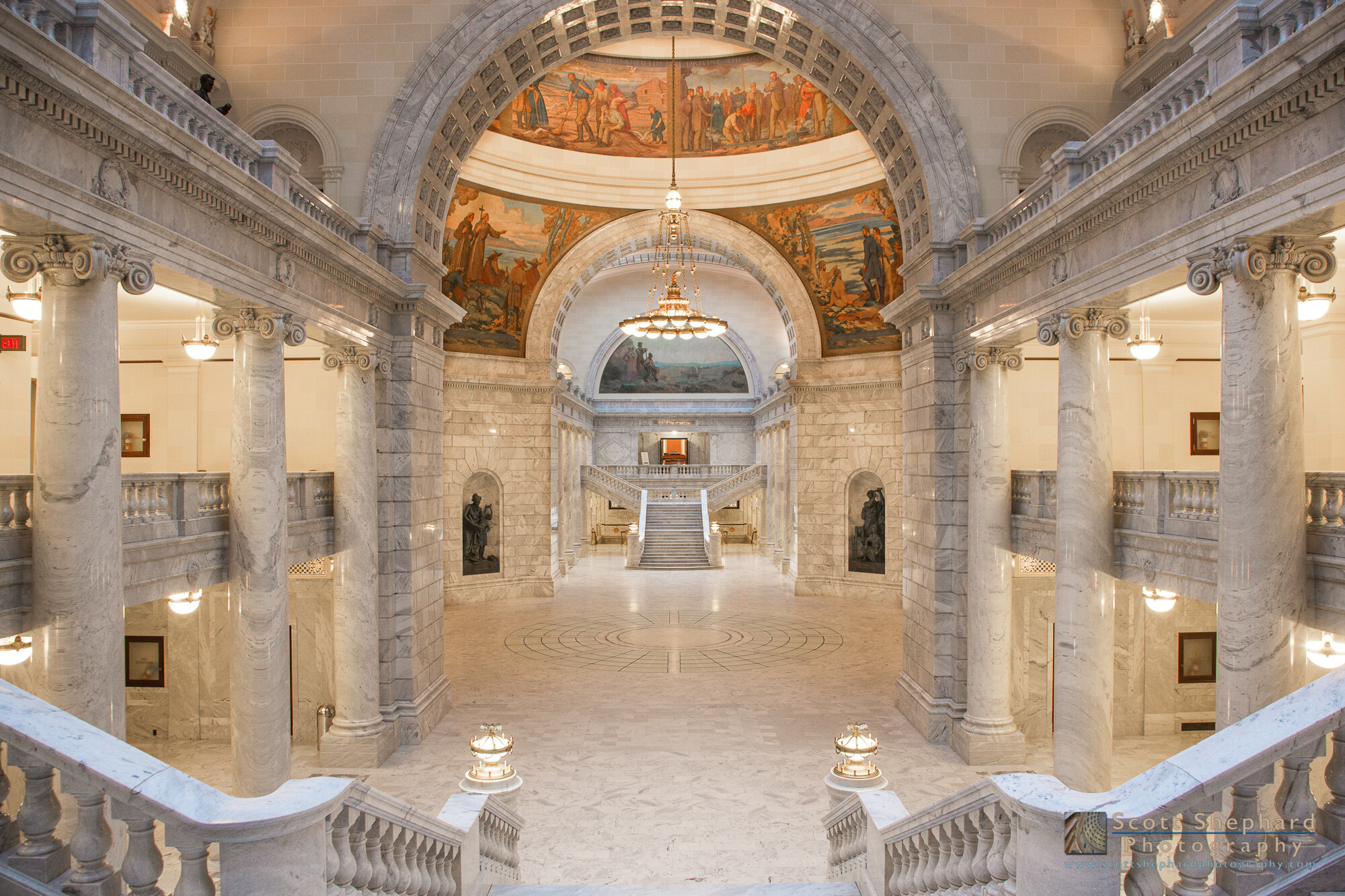
Photo #2
As a document, I think photo #2 is pretty good. But I guess I was looking to make something more than a document. I could have done this on the color version but I have an affinity to black and white, in part because 1) there isn’t that much color here and 2)black and white helps a person see things that color tends to hide. I’m mainly talking about lines, shapes and textures, which are abundant in a structure like this. Consider what is present here when I reduce the photo to something very basic, as you see in Photo #3. Clearly, shapes and structures become more obvious in the absence of color.

Photo #3
So I converted it to black and white. (Photo #4)

Photo #4
Next, in Photo #5 I adjusted the brightness and darkness of the photo with the intent to draw the viewer’s eye to the center of the image. This is probably where most of the “darkroom” work I performed happened.

Photo #5
Next, because it wasn’t quite what I was wanting in terms of texture and mood, I used a program called Tonality to apply a custom filter to the photo. (Photo #6)

Photo #6
Finally, in Photo #7 I applied a vignette to the scene to darken the corners and I brushed just a touch of lightness into the sides of the structures supported by the columns on each side. Those structures are natural leading lines that take your eye to what I think is the natural focal point of the photo - which happens to be the very center of the photo. So here’s the final result (which is also posted above) All of what I worked on, is much more obvious on a bigger screen. A smart phone is convenient, but not flattering to most photo like this.

Photo #7 (Final)
In all, it took me about 5 minutes to “take” the photo back in 2013 and it took me about an hour to “make” the photo. I don’t know about you, but I’m exhausted!
Was it worth it? As so often is the case, I can’t say. I like it, which I suppose is enough. But I hope you like it, too.
Canon 5DIII 1/13 second f/8 1250 ISO